


In today’s data-driven world, the ability to effectively communicate insights from complex data is essential. This is where the art of data visualization comes into play. Data visualization is the graphical display of data, allowing us to transform raw numbers and statistics into meaningful visual representations. By presenting data visually, we can uncover patterns, relationships, and trends that may not be apparent in raw numbers or text. In this comprehensive guide, we will explore the art of data visualization, from foundational principles to advanced techniques and emerging trends.
The Power of Data Visualization
Data visualization goes beyond presenting information in a visually appealing manner. It enables us to communicate complex ideas, simplify information, and convey insights efficiently. Visuals have a profound impact on human cognition, as we are naturally inclined to process visual information faster and more effectively than text. By leveraging this power, we can engage viewers and enhance their understanding of the data.
Principles of Effective Data Visualization
To create impactful data visualizations, we need to follow certain principles that enhance clarity, accuracy, and engagement. Some of the key principles include:
Relevance: Addressing the Needs of the Target Audience
The first step in creating effective data visualizations is understanding the needs and interests of the target audience. Visualizations should be relevant to the audience, addressing their pain points, challenges, or interests. By tailoring visualizations to their specific needs, we can captivate their attention and deliver meaningful insights.
Clarity: Communicating Complex Ideas Clearly
Clarity is crucial in data visualization to ensure that viewers understand the information being presented. Use simple language, intuitive design elements, and appropriate formatting to break up complex ideas into digestible visual components. Avoid clutter and unnecessary embellishments that can confuse or distract viewers from the main message.
Accuracy: Factual and Error-Free Representations
Maintaining data accuracy is paramount in data visualization. Ensure that the data used is sourced from reliable and reputable sources, properly cleaned, and validated. Transparently provide information about data sources, methodologies, and any assumptions made during the visualization process. Accuracy builds trust and credibility with the audience.
Storytelling: Engaging Narratives through Visuals
Data storytelling is a powerful technique that combines the art of storytelling with data visualization. By weaving a narrative around the data, we can engage viewers and guide them through the story that the data tells. Incorporate a compelling narrative arc, highlighting key insights and providing context to captivate the audience and foster deeper understanding.
Design Elements in Data Visualization
The aesthetics of data visualization play a vital role in conveying information effectively. Design elements such as position, color, shape, and size are used to encode and represent data visually. Let’s explore some of these design elements and their significance in data visualization.
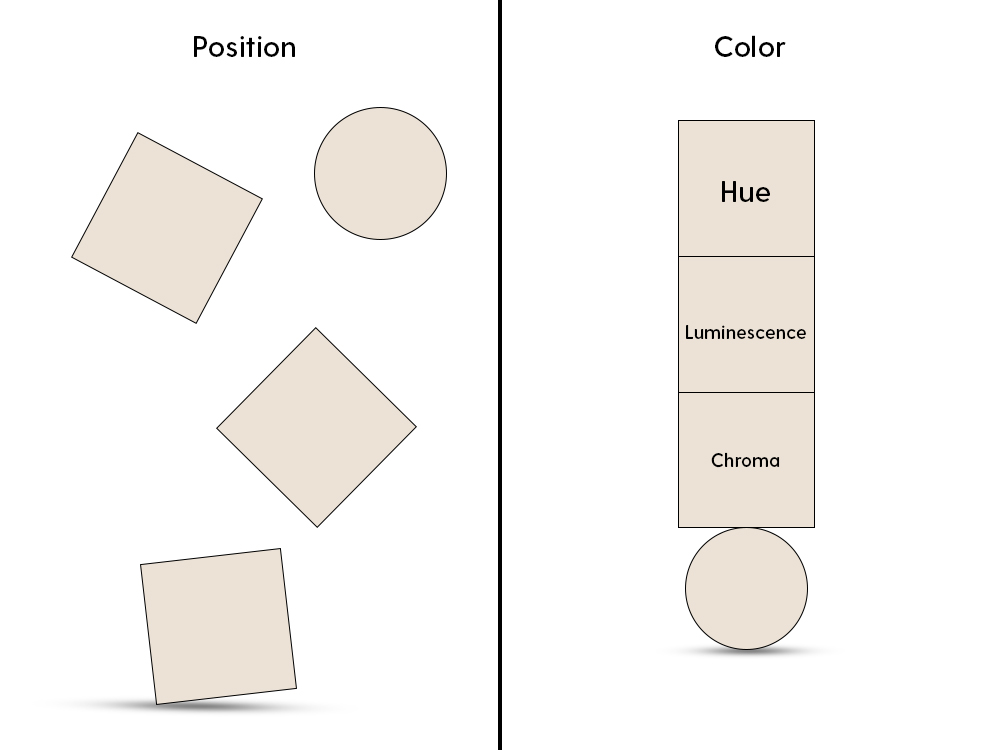
Position
Position is a fundamental design element in data visualization, where the x and y axes are used to represent variables and their values. The position of data points on a graph allows viewers to compare and analyze relationships between variables. Strategic positioning of elements can guide viewers’ attention and highlight key insights.
Color
Color is a powerful tool in data visualization, enabling us to convey information and patterns. Different colors can be used to represent distinct categories or to encode a third variable within a graph. However, it is crucial to use colors purposefully and ensure they are accessible to viewers with color vision deficiencies.
Hue
Hue refers to the shade of a color and is often used to group data based on categorical variables. By assigning different hues to different categories, we can visually distinguish between groups and identify patterns or relationships within the data.
Luminescence
Luminescence refers to the brightness or darkness of a color and is used to convey ordered values. By varying the luminescence of a color, we can represent gradients or hierarchical relationships in the data. Lighter shades often indicate higher values, while darker shades represent lower values.
Chroma
Chroma represents the vibrancy or saturation of a color and can also be used to convey ordered values. By manipulating the chroma of a color, we can highlight intensity or emphasize specific data points. Higher chroma indicates higher intensity or significance.
Exploring Advanced Techniques in Data Visualization

Building upon the foundational principles, let’s delve into advanced techniques that can elevate your data visualization to the next level. These techniques incorporate interactivity, multidimensionality, and innovative visualization methods to engage viewers and provide deeper insights.
1. Exploratory Graphics
Exploratory graphics are simple visuals used to identify patterns in data. These techniques help in the initial exploration and understanding of the dataset. Some commonly used exploratory techniques include scatter plots, histograms, and box plots. Exploratory graphics allow viewers to observe relationships, outliers, and distributions in the data.
2. Explanatory Graphics
Explanatory graphics go beyond exploration and focus on explaining patterns and providing evidence to support specific insights. These techniques are often used in data-driven storytelling and data-driven journalism. Examples of explanatory graphics include line charts, bar charts, and interactive visualizations. Explanatory graphics enable viewers to understand the story behind the data and draw meaningful conclusions.
3. Interactive Data Visualization
Interactive data visualization allows viewers to actively engage with the data, manipulate variables, and explore different perspectives. Interactive visualizations often incorporate features like tooltips, zooming, filtering, and animation. By empowering viewers to interact with the data, we can foster deeper engagement, facilitate data exploration, and promote a sense of ownership over the insights gained.
4. Multidimensional Visualization
Multidimensional visualization techniques are designed to represent data with more than two or three dimensions. They involve mapping additional variables to visual attributes like shape, size, color, or texture. Techniques such as parallel coordinates, treemaps, and radar charts enable the representation of complex relationships and multivariate data. Multidimensional visualization expands the possibilities of data exploration and analysis.
5. Infographics and Dashboards
Infographics and dashboards combine multiple visualizations and textual elements to present data in a concise and easily digestible format. Infographics focus on presenting key insights and messages in a visually appealing manner, often using icons, illustrations, and typography. Dashboards, on the other hand, provide a dynamic interface for monitoring and analyzing real-time data. These techniques facilitate quick understanding and decision-making by presenting data at-a-glance.
Showcasing the Power of Data Visualization

Now that we have explored the foundational principles and advanced techniques of data visualization, let’s dive into real-world examples and case studies that demonstrate the power of data visualization in various domains.
Marketing and Sales
Data visualization plays a crucial role in marketing and sales by helping businesses gain insights into customer behavior, market trends, and campaign performance. Visualizing customer segmentation data can aid in identifying target demographics and tailoring marketing strategies accordingly. Sales teams can utilize visualizations to track sales performance, identify patterns, and forecast future trends. By presenting data visually, marketing and sales professionals can make informed decisions and optimize their strategies.
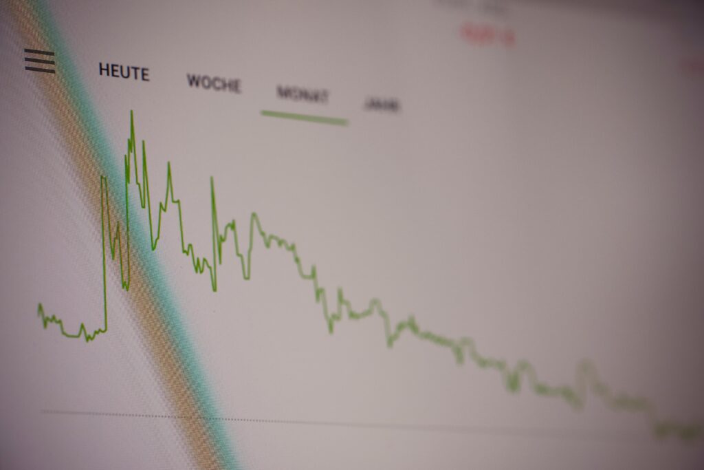
Finance and Investment
In the finance industry, data visualization enables professionals to analyze complex financial data, identify trends, and make data-driven investment decisions. Visualizations of stock market trends, portfolio performance, and risk analysis provide a comprehensive view of the financial landscape. Interactive dashboards can empower investors to explore historical data, compare assets, and simulate different scenarios. Data visualization in finance enhances transparency, aids in risk management, and enables better financial planning.
Healthcare and Medicine
Data visualization is revolutionizing healthcare and medicine by facilitating the analysis of patient data, medical research, and disease patterns. Visualizations of patient records, medical imaging, and genomic data help healthcare professionals diagnose diseases, track treatment outcomes, and identify correlations. Researchers use visualizations to uncover patterns in large datasets, leading to new insights and advancements in medical science. By visually representing complex medical information, data visualization improves patient care, research efficiency, and medical decision-making.
Social Sciences and Public Policy
Data visualization is a valuable tool in the social sciences and public policy, aiding researchers and policymakers in understanding societal issues, trends, and the impact of policies. Visualizations of demographic data, socioeconomic indicators, and public opinion surveys enable researchers to identify patterns and correlations. Policymakers can leverage visualizations to communicate policy goals, forecast outcomes, and engage stakeholders. Data visualization empowers evidence-based decision-making, fosters public understanding, and drives positive social change.
Environmental Science and Sustainability
Environmental scientists rely on data visualization to analyze climate data, monitor ecological systems, and communicate the urgency of environmental challenges. Visualizations of temperature trends, deforestation rates, and carbon emissions help in understanding the impact of human activities on the environment. Interactive maps and geospatial visualizations enable scientists to track habitat changes, predict natural disasters, and design conservation strategies. Data visualization in environmental science promotes awareness, facilitates informed decision-making, and supports sustainable practices.
Conclusion
Data visualization is not only about creating visually appealing charts and graphs; it is a powerful tool for communicating complex insights, uncovering patterns, and driving informed decision-making. By understanding the foundational principles, exploring advanced techniques, and witnessing real-world examples, we can master the art of data visualization.
As technology advances and data continues to grow, the demand for skilled data visualization professionals will continue to rise. Whether you are a marketer, analyst, researcher, or decision-maker, honing your data visualization skills will give you a competitive edge in your field. Embrace the art of data visualization, unleash the power of your data, and communicate insights visually to make a lasting impact in your domain.
So, are you ready to embark on the journey of mastering the art of data visualization? Harness the power of visuals, unlock hidden insights, and transform your data into a compelling narrative that captivates and informs. Start visualizing your data today!
Remember, the art of data visualization is an ongoing learning process. Stay curious, explore new techniques, and continue refining your skills to create impactful visualizations that resonate with your audience.
Visit AI Data House to learn more about our data analytics services and how we can help you transform your data into actionable insights.