


In today’s data-driven business landscape, the ability to extract meaningful insights from vast amounts of data is crucial for success. Data visualization serves as a powerful tool to understand complex information and communicate it effectively. In this comprehensive guide, we will explore various data visualization techniques that can help you master the art of transforming raw data into actionable insights.
Addressing Challenges with Data Visualization
Data visualization is a powerful tool for transforming complex data into meaningful insights. However, it’s not without its challenges. In this section, we will explore some common challenges that arise when working with data visualization and discuss strategies to address them effectively.
The Challenge of Data Complexity
One of the biggest pain points in data analysis is dealing with complex datasets that contain numerous variables and relationships. It becomes challenging to identify patterns, trends, and correlations within the data, making it difficult to derive actionable insights. This is where data visualization techniques come to the rescue.
Overcoming Information Overload
In today’s information age, we are bombarded with an overwhelming amount of data. Making sense of this deluge of information can be overwhelming and time-consuming. Data visualization techniques provide a visual representation of data, enabling us to process information more efficiently and identify key insights quickly.
Communicating Insights Effectively
Presenting data in a clear and concise manner is essential for effective communication. Traditional spreadsheets and raw data tables often fail to engage the audience or convey the intended message. Data visualization offers a visually appealing way to present complex information, making it easier for stakeholders to understand and act upon the insights.
Benefits of Data Visualization Techniques
Data visualization techniques offer numerous advantages that can greatly enhance your data analytics process and drive better decision-making. Here are some key benefits of incorporating data visualization into your analytical workflow:
Enhanced Comprehension
Data visualization techniques allow us to transform complex datasets into visual representations that are easier to comprehend. By using visual elements like charts, graphs, and diagrams, we can distill complex information into digestible and intuitive formats. This makes it easier for both data analysts and non-technical stakeholders to understand and interpret the data.
Improved Decision-Making
Data-driven decision-making is at the core of successful businesses. By visualizing data, decision-makers gain a deeper understanding of the information at hand, enabling them to make informed choices. Data visualization techniques highlight trends, outliers, and patterns that might go unnoticed in raw data, leading to better-informed decisions.
Enhanced Storytelling
Humans are wired to respond to stories. Data visualization techniques allow us to tell compelling stories with data by presenting information in a narrative format. By weaving together visual elements, we can guide the audience through a story that reveals insights, creates impact, and drives action.
Accelerated Data-Driven Actions
The ultimate goal of data analysis is to drive action and achieve tangible results. Data visualization techniques provide a clear and actionable view of the data, empowering organizations to make data-driven decisions swiftly. By visually representing key metrics and trends, businesses can identify areas for improvement, optimize strategies, and seize opportunities.
Exploring Data Visualization Techniques
Now that we understand the benefits of data visualization, let’s explore some key techniques that can transform your data into visually engaging and insightful representations.
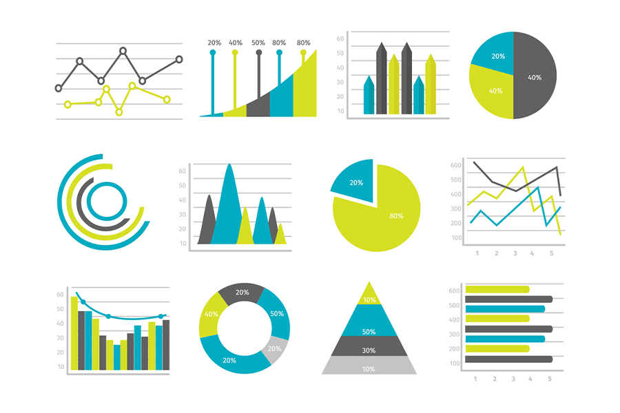
Pie Chart
The pie chart is a classic visualization technique that represents data as slices of a circle, with each slice corresponding to a specific category or proportion of the whole. It is effective for displaying proportions or percentages and comparing different categories.
Bar Chart
The bar chart is a versatile visualization technique that uses rectangular bars to represent data values. It is ideal for comparing discrete categories or showing the distribution of data across different groups. Bar charts can be horizontal or vertical, depending on the data and the intended presentation.
Histogram
Histograms are used to display the distribution of continuous data. They group data into bins and represent the frequency or count of data points within each bin using bars. Histograms provide insights into the shape, central tendency, and variability of the data distribution.
Gantt Chart
Gantt charts are popular in project management to visualize project schedules and timelines. They display tasks or activities as horizontal bars along a time axis, allowing project managers to track progress, identify dependencies, and allocate resources effectively.
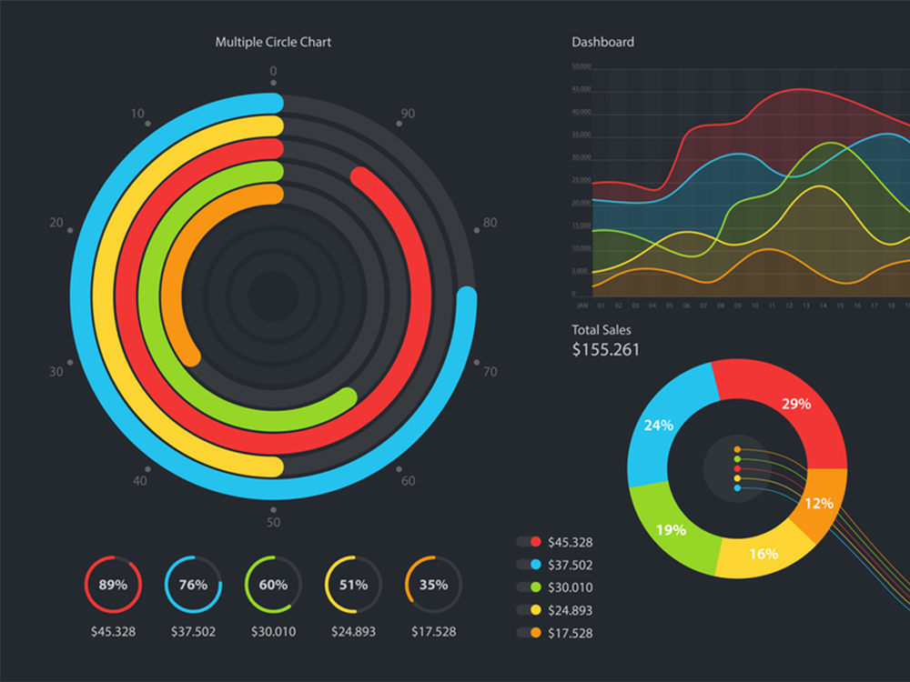
Heat Map
Heat maps use color gradients to represent the intensity or density of values across a matrix or grid. They are commonly used to display correlations, highlight patterns, or identify areas of interest within large datasets. Heat maps provide a visual summary of complex data relationships.
Box and Whisker Plot
Box and whisker plots, also known as box plots, provide a graphical representation of the distribution of a dataset. They display the median, quartiles, and outliers, allowing us to understand the spread and variability of the data. Box plots are useful for comparing multiple groups or identifying anomalies.
Waterfall Chart
Waterfall charts illustrate how an initial value is affected by various positive and negative factors, leading to a final value. They are useful for visualizing financial statements, budget breakdowns, or any scenario where it is important to understand the cumulative impact of different factors on a total value.
Area Chart
Area charts depict the cumulative magnitude of data values over time. They are effective for visualizing trends, showing the composition of a whole, or comparing multiple series. Area charts provide a sense of the total value while highlighting the contribution of individual components.
Scatter Plot
Scatter plots represent the relationship between two continuous variables. They plot data points on a two-dimensional graph, with each point corresponding to a unique combination of the variables. Scatter plots help identify correlations, clusters, or outliers within the data.
Pictogram Chart
Pictogram charts use visual symbols or icons to represent data values. They are engaging and intuitive, making them suitable for presenting data to a wide audience, including children or non-technical stakeholders. Pictogram charts effectively convey information while maintaining visual appeal.
Timeline
Timelines visualize chronological events or milestones along a linear axis. They are useful for illustrating historical data, project timelines, or any sequence of events. Timelines provide a clear overview of temporal relationships and help contextualize data within a specific timeframe.
Highlight Table
Highlight tables combine text and color to emphasize specific values within a table. They are effective for highlighting key insights, outliers, or performance indicators. Highlight tables allow viewers to quickly identify important data points and draw attention to critical information.
Bullet Graph
Bullet graphs are a variation of bar charts designed to display progress towards a goal or target. They use a single bar and additional visual indicators to represent the actual value, target value, and performance ranges. Bullet graphs provide a compact and informative way to assess performance.
Choropleth Map
Choropleth maps use color gradients or patterns to represent data values across geographic regions, such as countries or states. They are effective for visualizing spatial patterns, regional differences, or population distributions. Choropleth maps offer a compelling way to present data with geographical context.
Word Cloud
Word clouds display text data in a visual format, where the size of each word represents its frequency or importance. They are useful for identifying key terms, analyzing text sentiment, or summarizing large amounts of textual information. Word clouds provide a quick visual summary of textual data.
Network Diagram
Network diagrams visualize the relationships and connections between nodes or entities. They are commonly used in social network analysis, supply chain optimization, or any scenario involving interconnected elements. Network diagrams help uncover hidden relationships and understand the structure of complex networks.
Correlation Matrix
Correlation matrices display the correlation coefficients between multiple variables in a tabular format. They provide insights into the strength and direction of relationships between variables. Correlation matrices are essential for understanding dependencies and identifying influential factors.
Conclusion
In conclusion, mastering data visualization is a crucial skill for deriving valuable insights and effectively communicating information. By leveraging various data visualization techniques like pie charts, bar charts, histograms, and many others, you can transform raw data into meaningful visuals that drive decision-making and enable data-driven actions. Embrace the power of data visualization and unlock the full potential of your data analytics endeavors.
Remember, the key to effective data visualization is to choose the right technique for your specific dataset and intended message. Experiment with different visualizations, incorporate storytelling elements, and strive for clarity and impact in your visual representations. Start mastering data visualization today and empower yourself with the ability to uncover hidden insights within your data.
Ready to master data visualization and unlock the power of your data? Enroll in our comprehensive online course on Data Visualization Techniques today! Visit aidatahouse.com to learn more and embark on your data visualization journey. Gain the skills to create compelling visuals, derive valuable insights, and make data-driven decisions. Don’t miss out on this opportunity to take your data analytics skills to the next level. Sign up now!