


In today’s data-driven world, effective data visualization has become essential for businesses and organizations to communicate insights, make informed decisions, and drive actionable outcomes. Well-designed data has the power to simplify complex information, uncover patterns, and engage audiences. This comprehensive guide will explore the best practices for designing compelling data visualizations that effectively convey insights and captivate viewers.
Understanding the Power of Data Visualization
Data visualization is the graphical representation of data that transforms raw information into meaningful visuals, making it easier to understand and interpret. It helps us identify trends, relationships, and patterns that might not be apparent in raw data alone. By presenting data visually, we can convey complex information in a concise and accessible manner.
Visualizing Data: The Key to Unlocking Insights
Data visualization allows us to unlock the potential insights hidden within vast amounts of data. It enables us to grasp complex concepts quickly and make data-driven decisions. Whether you’re analyzing sales trends, customer behavior, or market research, data serves as a powerful tool for extracting actionable insights.
Applying Best Practices for Effective Data Visualization

To create compelling and impactful data visualizations, it’s important to follow best practices that enhance clarity, engagement, and comprehension. Let’s explore these best practices in detail:
1. Plan and Define Objectives
Before diving into analytical visualization, it’s crucial to clearly define your objectives and identify the purpose of your visualization. Consider the target audience, the message you want to convey, and the specific insights you aim to highlight. This initial planning phase will guide your design decisions throughout the process.
2. Choose the Right Visualization Type
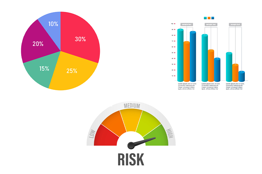
Not all data visualizations are created equal, and choosing the appropriate visualization type is vital for effectively conveying your message. Consider the nature of your data, the relationships you want to illustrate, and the story you want to tell. Common visualization types include bar charts, line graphs, scatter plots, and heatmaps. Each type has its strengths and is suited for different purposes.
3. Simplify and Focus
Simplicity is key when it comes to data visualization. Avoid cluttering your visualizations with unnecessary elements or overwhelming amounts of data. Keep your visuals clean, concise, and focused on the key insights you want to communicate. Remove any distractions that might hinder comprehension or mislead viewers.
4. Utilize Visual Cues
Visual cues play a crucial role in guiding viewers’ attention and emphasizing important aspects of your data. Incorporate visual cues such as color, size, position, and shape to highlight patterns, trends, and outliers. Use color strategically to encode additional information or represent different categories. Ensure that your color choices are accessible to all viewers, including those with color vision deficiencies.
5. Tell a Story with Your Data
Data storytelling is a powerful technique that engages viewers and helps them connect with the insights you’re presenting. Craft a narrative around your data by structuring your visualizations in a logical sequence. Start with an engaging introduction, present the data progressively, and conclude with a clear takeaway. Guide viewers through your visualizations, highlighting the significance of each step and providing context along the way.
6. Ensure Clarity and Accessibility
Clarity is of utmost importance in data visualization. Design your visualizations to be easily understood by a wide range of viewers, including those who might not have a background in data analysis. Use intuitive labels, clear legends, and appropriate scaling. Avoid jargon or overly technical language that might alienate your audience. Test your visualizations with different users to ensure they are accessible and comprehensible to all.
7. Iterate and Refine
Data visualization is an iterative process. Continuously evaluate and refine your visualizations based on feedback and data analysis. Pay attention to how viewers interpret and interact with your visuals. Refine the design, layout, and labeling based on their understanding and needs. Iteration is key to improving the clarity, accuracy, and impact of your visualizations.
Embracing the Art and Science of Data Visualization
Data visualization is both an art and a science. It combines creative design principles with analytical rigor. By striking the right balance, you can create visualizations that are visually appealing, accurate, and impactful.
The Art of Data Visualization
Design aesthetics play a crucial role in capturing viewers’ attention and engaging their emotions. Carefully consider color palettes, typography, and layout to create visually pleasing visuals. The choice of visual elements and their arrangement can evoke specific emotions and enhance the overall user experience. However, remember to maintain a balance between aesthetics and functionality, ensuring that your design choices enhance the understanding of the data rather than overshadow it.
The Science of Data Visualization
Data visualization is rooted in scientific principles. It involves understanding data characteristics, statistical techniques, and cognitive psychology. By applying these principles, you can ensure that your visualizations accurately represent the underlying data and facilitate accurate interpretation. Avoid distorting or misrepresenting data through misleading scales, truncated axes, or inappropriate visual encoding.
Elevate Your Data Visualizations Today!
Are you ready to take your data to the next level? Start implementing these best practices and unleash the power of visual storytelling in your data presentations. Here’s how you can get started:
- Evaluate your current visualizations: Take a critical look at your existing data visualizations and assess how well they align with the best practices discussed in this article. Identify areas for improvement and areas where you can leverage the strengths of your current visualizations.
- Explore visualization tools: There are numerous tools available that can assist you in creating impactful visualizations. From popular options like Tableau and Power BI to open-source libraries like D3.js and Plotly, explore different tools to find the one that best suits your needs and skill level.
- Experiment with different visualization types: Don’t be afraid to step out of your comfort zone and experiment with various visualization types. Each type has its unique advantages and is suitable for different types of data and insights. Test different charts, graphs, and maps to see which ones effectively convey your message.
- Seek feedback and iterate: Share your visualizations with colleagues, stakeholders, and even end users to gather feedback. Listen to their perspectives and identify areas where the visualizations can be improved. Embrace an iterative mindset and continuously refine your designs based on user feedback and data analysis.
- Stay updated with industry trends: Data visualization is a dynamic field, with new trends and techniques emerging regularly. Stay informed about the latest developments by reading blogs, attending webinars, and participating in data visualization communities. This will keep your skills sharp and inspire you to push the boundaries of what’s possible.
Remember, data visualization is a skill that improves with practice. Embrace a mindset of continuous learning and improvement as you embark on your data visualization journey. Let the data speak through compelling visuals that captivate and inform your audience.
Conclusion
Data visualization is no longer a mere tool for presenting data; it has evolved into a powerful medium for storytelling and decision-making. By employing the best practices discussed in this article, you can create data visualizations that not only inform but also inspire and engage.
From planning your objectives and choosing the right visualization type to telling a compelling data story and ensuring clarity and accessibility, every step you take towards effective data visualization brings you closer to unlocking the true potential of your data.
So, embrace the art and science of data visualization. Let your creativity soar as you design visually stunning and impactful visualizations. Remember to always put your audience at the forefront and strive for clarity, simplicity, and meaningful insights. Elevate your data visualizations today and unleash a new level of understanding and decision-making.
Ready to revolutionize your data visualizations? Visit our website at AI Data House to discover how our expert team can help you transform your data into captivating visuals that drive insights and empower decision-making. Take the next step in enhancing your data visualization capabilities and unlock the full potential of your data. Get in touch with us today!