Welcome back to our transformative AppSheet series, where we embark on a journey of app creation and customization, empowering small and medium-sized businesses (SMBs) with cutting-edge solutions. In our previous articles, we’ve explored the boundless potential of AppSheet, from building project tracking apps to mastering data slicing, unveiling view types, harnessing the magic of data visualization through charts, and exploring primary and menu navigation.
Now, we venture into the realm of AppSheet dashboard customization. In today’s digital landscape, effective data visualization is crucial for making informed decisions and gaining valuable insights. These customized dashboards not only elevate your app’s aesthetics but also amplify your team’s ability to make data-driven decisions and stay ahead of the competition.
In this article, we will explore how advanced customization options can transform your AppSheet dashboards and provide tailored visualizations that align with your unique business needs.
What Can You Do With a Dashboard?
Dashboards are powerful tools that serve as information hubs, presenting critical data in a visually engaging and easily digestible format. In the context of AppSheet, dashboards take on a whole new dimension, offering a comprehensive view of your app’s data and insights. So, what exactly can you do with an AppSheet dashboard? Let’s explore the myriad possibilities:
1. Monitor Key Performance Indicators (KPIs)
Dashboards act as a centralized location to track and monitor essential KPIs that drive your business forward. From sales figures to project progress and customer satisfaction metrics, KPIs on the dashboard provide real-time visibility into your organization’s performance.
2. Visualize Data Trends
AppSheet dashboards present data trends through interactive charts, graphs, and visualizations. From pie charts displaying revenue distribution to line graphs showcasing project timelines, these visual representations facilitate a deeper understanding of data patterns.
3. Facilitate Data-Driven Decision Making
Armed with comprehensive data presented on the dashboard, you and your team can make informed decisions swiftly. Whether it’s adjusting project timelines, reallocating resources, or fine-tuning marketing strategies, dashboards equip you with valuable insights to guide your actions.
4. Streamline Communication
Dashboards serve as a common ground for teams to collaborate and discuss progress. By sharing the dashboard with stakeholders, you enable transparent communication and ensure everyone stays on the same page.
5. Customize for Relevance
AppSheet dashboard customization options allow you to tailor the layout and content to cater to specific user needs. Filtered views, personalized charts, and interactive components ensure that each user receives the data most relevant to their role.
6. Analyze Project Health
With a well-structured dashboard, project managers can assess project health at a glance. Track milestones, budget utilization, and resource allocation effortlessly to ensure projects stay on track.
7. Identify Business Opportunities
Data visualization on the dashboard helps identify potential business opportunities and areas for improvement. From spotting new market trends to analyzing customer behavior, dashboards offer a treasure trove of insights waiting to be explored.
8. Access Data Anywhere, Anytime
With AppSheet’s mobile responsiveness, dashboards are accessible on-the-go, allowing you to stay connected with your data and business operations regardless of your location.
Creating a Dashboard
Dashboards in AppSheet are like putting together puzzle pieces. Each piece represents a different view that you have already created in our app, such as a chart view or a table view. When you assemble these pieces, you get a complete and beautiful picture. Let’s start building your dashboard step by step.
Creating a New View
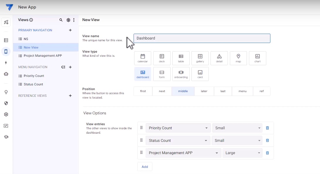
In the primary section, create a new view. Select the view type as “Dashboard.”

Selecting Dashboard Pieces
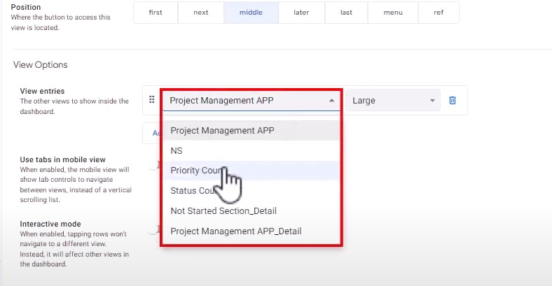
Now, you need to choose the pieces that you want to see in your dashboard. For example, you may want to include the priority count, status count, and the project management app view that displays all the projects.
Customizing the View
Adjust the details of the view to your preference. You can choose the larger view, wide view, standard view, or small view based on your needs. These options are particularly useful when using the app in desktop mode.

Naming the Dashboard
A good dashboard name is like a captivating book title—it grabs people’s interest. Give your dashboard a name that represents its purpose. For now, let’s keep it simple with the name “Dashboard.”
Mobile View and Desktop Mode
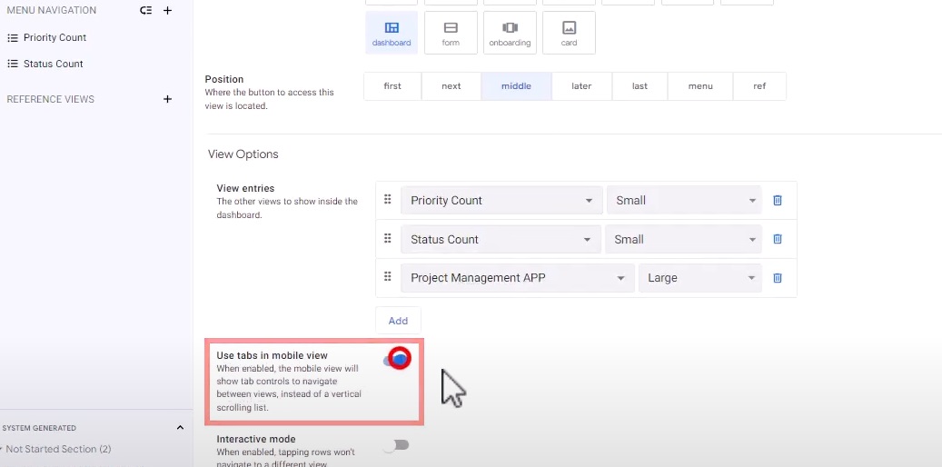
In the mobile option, you have the flexibility to enable the “Use tabs in mobile view” feature. This provides a clean and organized dashboard experience for mobile users. Additionally, when using the app in desktop mode, the dashboard can be opened in a separate section, providing a dedicated space for easy access.
Interactivity and Magic of Dashboards
Now that you have learned how to create and customize dashboards in AppSheet, let’s explore the interactivity and magic that AppSheet dashboards offer.
Click to Dive Deeper

AppSheet dashboards are designed to provide a seamless user experience. With just a click, you can dive deeper into the data and uncover more insights. Let’s say you have a chart displaying project status. By clicking on a specific section of the chart, you can access detailed information about the projects falling under that status.
User-Friendly Charts

AppSheet offers a variety of chart options to visualize your data. Whether it’s a pie chart, bar graph, or line chart, you can choose the one that best represents your project information. Charts provide a visual snapshot of your data, making it easier to identify trends, patterns, and areas of focus.
Details at Your Fingertips

Within the dashboard, you can have sections dedicated to displaying essential information. For example, you can include a section that shows the total number of ongoing projects, completed projects, and upcoming deadlines. This gives you a bird’s eye view of your project management at a single glance.
AppSheet dashboards are fully interactive, enabling you to take actions directly from the dashboard. Let’s say you have a section displaying pending tasks. You can click on a task to mark it as completed, update its status, or assign it to a different team member. This seamless interactivity saves time and enhances collaboration.
Besides, from color schemes to font choices, you have the flexibility to create a beautiful dashboard that reflects your style and enhances the user experience.
From Standard To Extraordinary
Dashboards play a central role in presenting complex data in a visually engaging manner, facilitating data-driven decision-making and fostering a data-driven culture within your organization. By harnessing the power of AppSheet’s dashboard customization features, you can create personalized and intuitive dashboards that resonate with your team and stakeholders.
Stay tuned for more insightful content as we delve deeper into the customization options. Don’t settle for standard dashboards – take it to the next level with AppSheet customization and unlock the full potential of your data.
Ready to take your dashboards to the next level? Visit AI Data House to get started. Our team is also available to provide personalized assistance and guidance in creating tailored visualizations for your specific business needs.

