


Welcome back to our transformative AppSheet video series, where we embark on a journey of empowering your projects with dynamic app creation and customization. In our previous articles, we have explored the vast potential of AppSheet, from building project tracking apps to mastering data slicing and unveiling various view types for optimal data presentation.
Now, we delve into the realm of data visualization with charts. AppSheet charts offer a robust toolkit for representing your data in graphical formats, from interactive pie charts to insightful bar graphs. These powerful visualizations not only enhance the aesthetics of your apps but also foster a deeper understanding of complex data patterns and trends.
In this illuminating guide, we’ll explore the diverse range of chart options AppSheet offers, empowering you to choose the perfect visualization to convey your project’s data with precision.
Creating a Simple Bar Chart
Visualizing project data is crucial for gaining insights and managing your projects efficiently. With AppSheet’s charting capabilities, you can transform your project data into powerful visual representations. In this part, we’ll start by creating a simple bar chart that displays the count of projects by their status. Follow these steps to create your first chart:
Step 1: Click on the “Views” button in the AppSheet interface.
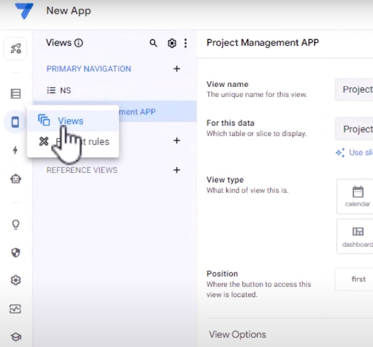
Step 2: Click on the “+” button to create a new view.

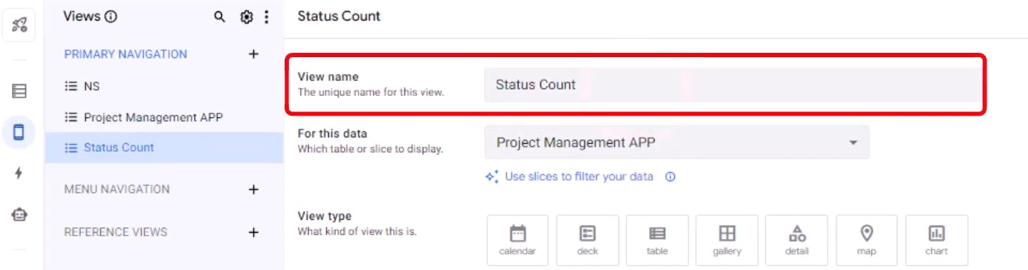
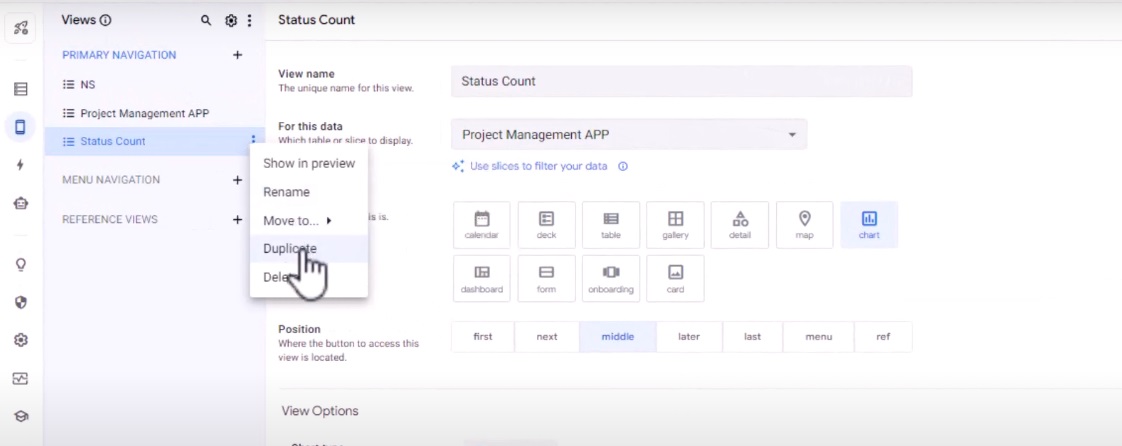
Step 3: Name the view as “Status Count” to reflect its purpose.
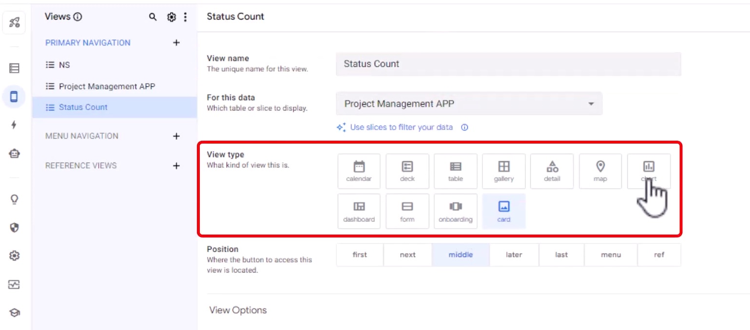
Step 4: Choose the view type as “Chart” to create a chart view.
Step 5: Select your project management app as the data source for the chart.

Step 6: Choose the chart type as “Horizontal Bar” to visualize the count effectively.

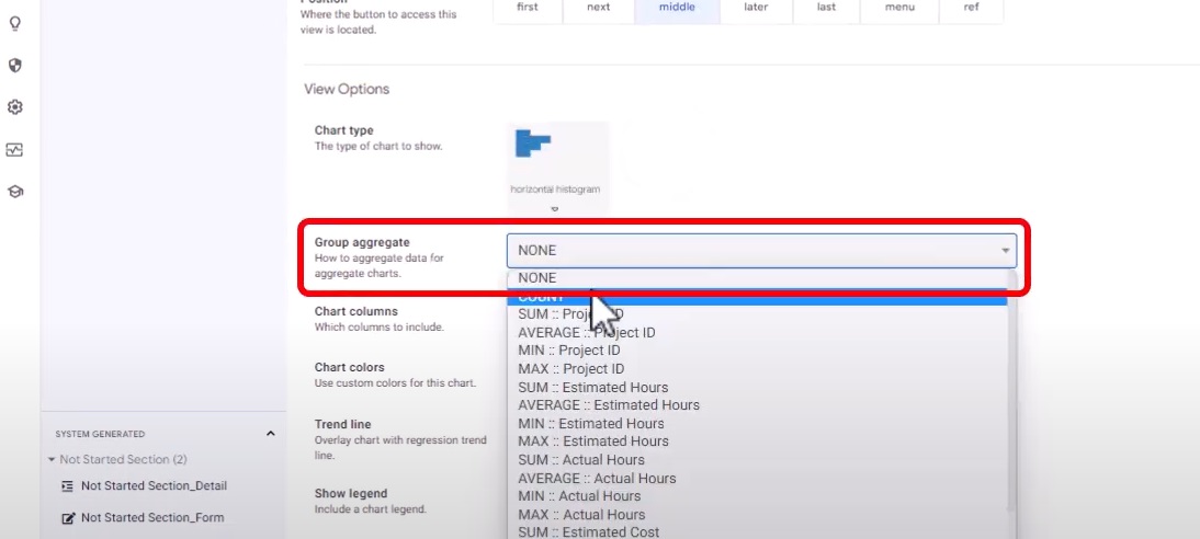
Step 7: In the “Group Aggregate” section, select “Count” as we want to count the number of projects with each status.
Step 8: For the chart column, choose “Status” to categorize the projects by their status.
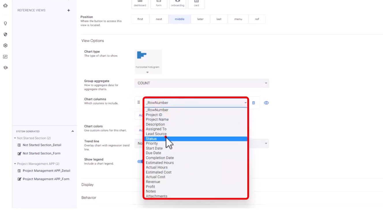
Congratulations! You have created your first chart in AppSheet. This simple bar chart will display the count of projects for each status, allowing you to quickly assess the distribution of projects across different stages.

Customization Of Chart
AppSheet offers a range of customization options to tailor your chart to your specific needs and brand identity. Customize your chart colors, hide the legend if necessary, and modify the axis labels and titles to provide clear context.


Advanced Chart Types
In addition to simple bar charts, AppSheet offers various chart types to suit different data visualization needs. Let’s explore a few advanced chart types:
Line Charts
Line charts are useful for showcasing trends and changes over time. They can represent data points connected by lines, allowing you to identify patterns or fluctuations in your project data.
Pie Charts
Pie charts display the proportionate distribution of projects based on certain criteria. They provide a clear visual representation of the relative sizes of different project categories, such as project types or departments.
Area Charts
Area charts are ideal for visualizing cumulative data or comparing multiple data series. They showcase the overall magnitude of a specific category and allow you to identify trends or shifts in project data over time.
Scatter Plots
Scatter plots are effective for analyzing relationships between two variables. They plot individual project data points on a two-dimensional graph, helping you identify correlations or outliers.
Organizing Views
As you incorporate multiple charts into your project tracking app, organizing your views becomes essential. Duplicate views, organize them strategically, and consider creating interactive dashboards to streamline the app’s layout and enhance user experience.
Take Control Of Your Projects
AppSheet charts provide a game-changing solution for project data analysis. By leveraging these powerful features, you can gain deeper insights, identify trends, and make data-driven decisions.
As you continue your app-building journey, remember the versatility and creativity AppSheet provides to showcase your data in the most meaningful ways. Our comprehensive guide on AppSheet charts has equipped you with the tools to create visually stunning apps that resonate with your team and stakeholders.Stay tuned for more insightful content as we continue our no-code journey together.
Ready to supercharge your projects with AppSheet charts? Visit AI Data House and experience the power of visualizing and analyzing your project data like never before.